 Teevee Gold
9 years 11 months ago - 9 years 11 months ago #1
by jimmy
Teevee Gold was created by jimmy
Another custom thingy. Woooooo. 
Information:
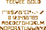
Name: Teevee Gold
Variants: 3
Type: SmallFont
Format: FON2
Replaces: N/A
Size: 9px
Paletted: Doom
Lower-cases: No
Individual glyphs/character maps included: Yes
Standard GFX included: N/A
Credits:
Submitted: Jimmy
Author: Jimmy / Thomas van der Velden
Original font: Found on TVR! credit pic
Idea Base: Full font based on short bit of custom text on the CREDIT pic of Thomas van der Velden's "Revolution!" megawad.
Description: The three variants are "Gold" (previewed), "Gold shadowed" and "Dark". "Teevee Dark" is the original color of the font. The uploader recommends the "shadowed" variant of this font above the two others, which are mainly included for preservation purposes. Only glyphs changed from original are A and L. Numbers and symbols all custom.
Preview:
Download:
http://jimmy.the-powerhouse.net/WAD/fonts/TeeveeGoldFont.pk3
Information:
Name: Teevee Gold
Variants: 3
Type: SmallFont
Format: FON2
Replaces: N/A
Size: 9px
Paletted: Doom
Lower-cases: No
Individual glyphs/character maps included: Yes
Standard GFX included: N/A
Credits:
Submitted: Jimmy
Author: Jimmy / Thomas van der Velden
Original font: Found on TVR! credit pic
Idea Base: Full font based on short bit of custom text on the CREDIT pic of Thomas van der Velden's "Revolution!" megawad.
Description: The three variants are "Gold" (previewed), "Gold shadowed" and "Dark". "Teevee Dark" is the original color of the font. The uploader recommends the "shadowed" variant of this font above the two others, which are mainly included for preservation purposes. Only glyphs changed from original are A and L. Numbers and symbols all custom.
Preview:
Download:
http://jimmy.the-powerhouse.net/WAD/fonts/TeeveeGoldFont.pk3
Attachments:
Last edit: 9 years 11 months ago by jimmy.
Please Log in or Create an account to join the conversation.
9 years 7 months ago #2
by jimmy
Replied by jimmy on topic Teevee Gold
It's definitely not the best font I submitted, heh, but is there a reason it's not been decided on yet?
Please Log in or Create an account to join the conversation.
- BadMojo
-

- Wicked
-

Less
More
- Posts: 224
9 years 7 months ago #3
by BadMojo
Probably because it's not consistent, it's a bit messy and hard to read in my opinion, the font looks pretty standard in terms of style, the only thing different here from a standard monospace font is the red dots on the corners of some letters which is what really makes this unique, it would be better if those red dots were consistent amongst all of the letters, but even so, that's what makes it too.. Complicated?.. I dunno a good word for it but you know what I mean")
Replied by BadMojo on topic Teevee Gold
jimmy wrote: It's definitely not the best font I submitted, heh, but is there a reason it's not been decided on yet?
Probably because it's not consistent, it's a bit messy and hard to read in my opinion, the font looks pretty standard in terms of style, the only thing different here from a standard monospace font is the red dots on the corners of some letters which is what really makes this unique, it would be better if those red dots were consistent amongst all of the letters, but even so, that's what makes it too.. Complicated?.. I dunno a good word for it but you know what I mean
Please Log in or Create an account to join the conversation.
9 years 6 months ago #4
by Tormentor667
Replied by Tormentor667 on topic Teevee Gold
It's indeed not up to the quality that we are used to before But I am sure there will be places where it might be of good use, so I think approving is just okay.
But I am sure there will be places where it might be of good use, so I think approving is just okay. Please Log in or Create an account to join the conversation.